
An industry as people-oriented as financial planning will require efficiency in tandem with simplicity in the presenting of products and services.
In this day and age, that means setting up financial planner websites that allow for ease of use without sacrificing the quality and personability of your services.
In this article, you will learn what it takes to set up a website that ticks all boxes.
Financial advisor websites are no longer an optional luxury; rather, they’re a must-have.
Yes, you may rely on the revenue from traditional marketing methods to a certain extent, but most people nowadays learn about you through your website.
Unlike a social media page, a financial advisor website will allow you to go all out in your branding. Your creativity in marketing yourself will be crucial here.
However, what will also be doubly important is your firm grasp of solid financial planner web design.
Why Financial Advisors Need a Website
You have to understand that Technology has greatly affected client perceptions and preferences.
The needs of people looking for financial advice might be the same as they were 20 years ago.
However, the manner in which they are looking to satisfy that need has changed.
Here are a few reasons why you are better off setting up a website for your financial advice services.
It is Entry Level Digital Marketing
Most people will be introduced to your services through digital marketing by way of a search engine query.
If you have a website, chances are that your name will be listed in the first or second pages to satisfy the query. If you don’t have one, you will be missing out.
People Are Looking for Solutions and More Value Today
You will no longer convert prospective clients today just by telling them that you offer “the best financial advice” in your area. They have to know that you can offer value.
A good way to tell people that you know value is through the free content that you offer on your website.
If designed well, your website can serve as a preview of your insight into the world of financial planning.
It Helps You Keep Up With the Competition
When it comes to finding financial planning help, no one would select the first suggestion that comes up.
When it comes to wealth management your prospects will go over at least three recommendations before making a selection.
This is where visibility becomes important because you can’t be chosen if no one knows you exist in the first place.
A website may be used to accomplish this.
It Will Help You Build a Database of Client Information
Acquiring clients information directly in this day and age is not as easy as it was in the past.
You need to be subtle about it.
Websites for financial advisors can help you gather prospective client information as long as you offer something of value.
For instance, you might set up a weekly newsletter or blog that people can subscribe to and get notifications of new content.
Now let’s take a look at some of the top financial planning websites.
➡️ We recommend Elemetor + Hosting for building a WordPress Website. Even if you are a non-techie, you get access to a low-cost web builder, premium templates, and support in just a few clicks!
Best Financial Advisor Websites
1. Buckingham Strategic Wealth
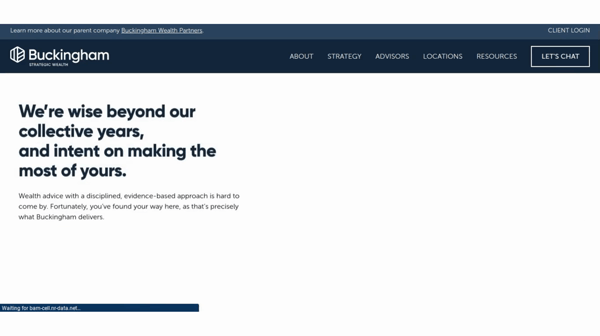
Buckingham Strategic Wealth stands out because they have never forgotten the fact that a website serves one purpose only: help visitors convert.
Their website has a modern flair to it with crisp transitions and animations on the homepage.
However, what makes it remarkable is that each page actually fulfills a certain stage of the client journey.
Every part of the page aids a prospect in coming to the conclusion that anything they may be needing might be supplied by the firm.
Takeaway: Your website’s design must satisfy the specific needs of your audience as they go through the conversion process.
It’s not enough to tell them that what you offer is good.
They must at first come to realize that what you offer can answer a particular need of theirs.
2. Stash Wealth

This company’s website has a rather striking message to greet all incoming internet users: “Spend it like you earn it”.
And with that one line, Stash Wealth immediately positions itself as a unique financial advice provider.
Takeaway: Stand out from the competition with a message that is both unique and indicative of the angle your services are offering.
3. HCR Wealth Advisors

This firm sports a clean website design that immediately tells you where to go and what to do there.
Aside from that, HCR Wealth Advisors has incorporated their messaging effectively to the layout of their website.
With a tagline of “Your Partner in Life and Wealth”, you are immediately given the impression that they are focused on lifestyle and not just financial planning.
In a market where services can look generic at a glance, that kind of angle stands out.
Takeaway: Always incorporate your message into the design. This will help in branding as well as your websites visibility in the search engines.
4. Define Financial
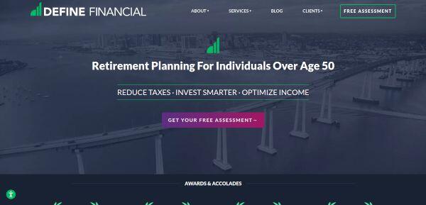
Define Financial’s website design takes full advantage of the Parallax layout.
Everything you’d want to know about the firm is laid out in only 4 pages with minimal loading in between.
Also, Define Financial pushes its credibility at the very forefront by highlighting the awards that it has received over the years.
In an industry where credibility is a huge concern, this makes Define Financial’s services all the more appealing to first-time clients.
Takeaway: Never be too shy to display the awards that your business or brand has received over the years.
Remember that clients base their decisions on the referrals of others.
The more credible the referral is, the quicker that person will convert into a client.
5. Riviera Capital
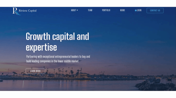
This firm’s website sports a sleek and clean design that uses the Parallax scrolling template.
What that means is that you can get a lot of information on one page without being overwhelmed.
Aside from a good layout, Riviera Capital also uses a rather specific angle with its messaging.
At a glance, you will immediately get the idea that this firm is meant for professionals and those who are serious about their investments.
Takeaway: Your design and messaging should work together and support the image that you want to project to the market.
If you want to look professional, then opt for a website design for financial planners that is easy to understand and clean looking, as well as a message that is straight to the point.
➡️ We recommend Elemetor + Hosting for building a WordPress Website. Even if you are a non-techie, you get access to a low-cost web builder, premium templates, and support in just a few clicks!
6. Avantax
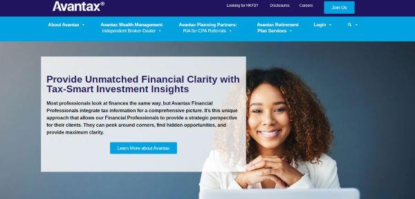
In some cases, you are better off delivering your message as is.
This is what helped Avantax make itself visible on the Internet with a website design that evokes simplicity and cleanliness.
The user interface is simple and straightforward, allowing visitors to swiftly discover what each page has to offer before clicking on it.
Furthermore, with an always visible control panel that remains in place no matter where you are in their webpages, navigating from one page to the next is simplified.
Takeaway: The layout of financial advisor websites must never compromise your branding.
Keep things simple and helpful so your site’s visitors won’t get lost in a sea of information which is likely in wealth management.
7. Bragg Financial
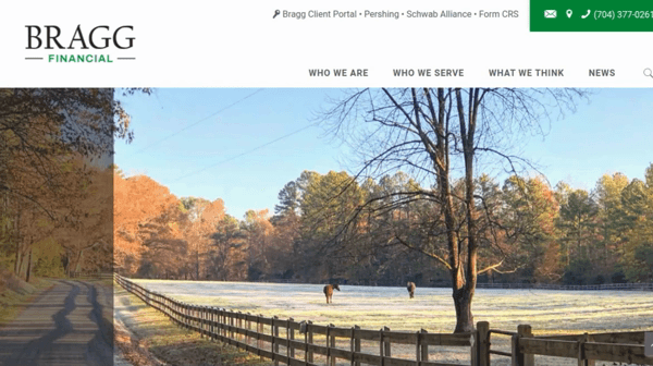
Bragg Financial’s website stands out for one reason: they focus quite a lot on building trust.
Upon entering the site, you are greeted with small tidbits of information telling you how the company has excelled in the past.
Aside from that, you will also learn where the firm has served and the quality of services they offer.
Takeaway: In wealth management, you must build trust quickly with your prospects with your content.
From testimonials to awards and even assurances, anything that can give them the impression that you know what you are doing will greatly help here.
8. Ratio Holdings

Ratio Holding’s website design has one goal in mind: to pique the interest of the user.
Instead of saying “we are here to offer our services” or something to that effect, the website says “Find your road to financial freedom.”
That line alone makes any visitor curious enough to learn more about what the website offers.
Takeaway: Get your site visitors curious enough about your brand to want to know more.
Your messaging here helps and your layout must serve to aid your message, whatever that may be.
9. Guide Financial Planning
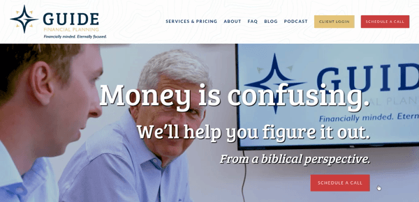
In most cases, you only need to hyper-focus your message to target a very niche segment of the market.
Guide Financial Planning’s pitch is providing financial services “from a Biblical perspective”.
With that line, they immediately make themselves unique by offering services geared towards the spiritually conscious.
At the same, they are not alienating the rest of their audience as their pitch still focuses on providing financial services.
Takeaway: Targeting a niche in the market will help you establish a foothold.
10. Personal Capital
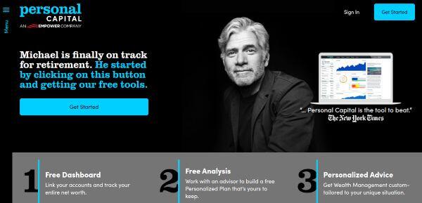
The design of Personal Capital’s website uses messaging that is not so conventional.
The focus on their message is the needs of the prospective client so the pitch is towards services that are “tailor-made” for every visitor.
This line gives the prospects an impression that the business will approach any problem that is unique to that situation.
Takeaway: Follow a layout that has worked with other successful firms but pay attention to the angle of your messaging.
Make sure that it at least makes you unique compared to your competition.
11 . Good Financial Cents
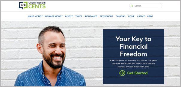
This firm’s website is all about action. Every section of Good Financial Cents pages always has a Call to Action that requires something from you.
Some CTAs on the site might ask you to reflect or ponder on something that will lead to you making a decision.
Others are more direct and require you to start a relationship with them.
Either way, a trip through this site will have a lot of your questions answered or you making a crucial financial decision.
Takeaway: Your call to action does not necessarily need to ask the viewer to convert.
Just make them do something that will contribute to the eventuality of them becoming a client.
*As a word of caution, if you choose to use a pop up, make sure you do not hurt the user experience. A pop up can now have a negative effect on your website rankings.
12. Mom and Dad Money
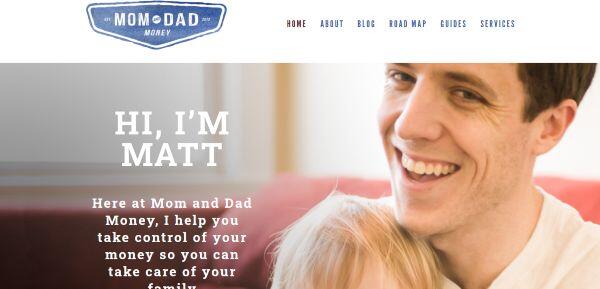
Right from the get-go, this firm’s website immediately delivers a subtle yet stand-out message.
From the angle of the messaging to the financial services being offered and even how the site frames the problems that their clients face, you are immediately given the impression that Mom and Dad Money is family-oriented.
Takeaway: Incorporate your branding into your website site’s design.
The placement of content in your website must give prospective clients an idea as to how your services frame a problem and then deal with it.
13. Fundamental Capital

In some cases, being direct with your messaging will work. This firm’s website design is simple but this is all made up with a rather direct message.
Right from the start, you will be told what Fundamental Capital does, what they excel in, and what quality you can expect from their financial services.
At the very least, this helps prospective clients make the decision whether or not to do business with them.
Takeaway: When it comes to your messaging, be as direct as possible.
It’s important that with your financial advisor websites that visitors don’t spend a lot of time figuring out your offer.
14. C.L. Sheldon & Company
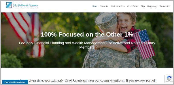
Aside from targeting a very specific niche in the market, this firm’s website also stands out for its use of multimedia.
Every button on C.L. Sheldon & Company website comes with a separate visual and supporting text.
By using text and images, the site helps its viewers get an idea as to what they should do there.
This can help improve the overall experience as well as conversions.
Takeaway: Use media strategically. Your visuals should catch the attention and imagination of your viewers while text guides them through your site.
15. The Savvy Tax Chick
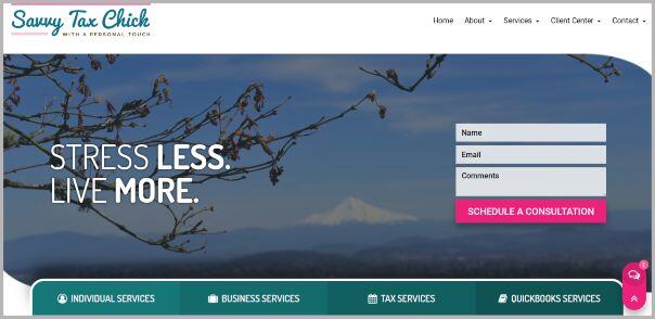
Aside from a clean-looking layout, the Savvy Tax Chick also managed to incorporate its unique branding into its website.
This results in a level of branding that is so unique and personal that no other financial advisor in the area can replicate.
Takeaway: Take advantage of your unique branding as much as possible when designing fianncial advisor websites. The best financial advisor websites are functional yet unique.
16. Zoe Financial
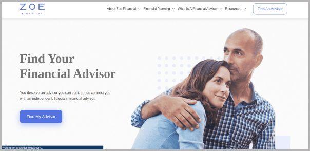
This financial advisor website has gotten something right when it comes to user experience: keep everything simple.
Right from the start, you will be told how a typical user experience with ZOE Financial goes. What makes it great is that the entire process can be completed in 3 steps.
Takeaway: The design of your website must aid in the user experience. They should have everything that they need to know from your website within a few minutes.
17. Johanson Financial Advisors
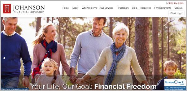
With an ingenious logo and usage of nice imagery, Johanson Financial Advisor’s website has a layout that evokes a professional yet comfortable feel as you go through the pages.
Making things even more convenient is a site design that aids the visitor as they go from one page to another.
Takeaway: Make your financial advisor websites stand out, but don’t forget about your potential clients basic needs like easy navigation and guidance.
The easier it is for a visitor to go from page to page and get what they need, the easier it will be for them to take that final step and convert to a client.
➡️ We recommend Elemetor + Hosting for building a WordPress Website. Even if you are a non-techie, you get access to a low-cost web builder, premium templates, and support in just a few clicks!
What Makes a Good Financial Advisor Website
So how can a financial advisor make their site stand out from the competition?
There are several aspects that make good financial advisor websites which will include the following:
Direct Targeting
Your financial advisor website must speak directly to a specific niche in the market.
This way, you give your pitch an angle unique enough to attract the attention of potential clients.
SEO Optimization
To be visible in the search engines, you must stick to the current standards being applied by the AI. Here, the quality of your content will matter. It must be engaging and directly speaking to your audience.
Useful Content
The content of your site must not have a “promotional” tone.
Instead, offer something of value like a solution to a specific problem or information that will help the viewer make the best possible investment decision.
Call to Action
The tone you will use will matter here. A good call to action now is less of “use our services” and more of “deal with your problem right now (with our services)”.
The simplest call to action you can have is an easy-to-find contact form.
Nurturing Opportunities
Keep your audience engaged through publishing regular content. A regular newsletter works in this regard in tandem with some email marketing strategies.
A Consistent Brand
You might notice that some of the financial advisor websites above keep their branding consistent.
They managed to incorporate their unique brand and color scheme into the layout.
Your website should not only be mechanically functional, aesthetically pleasing, and easy to navigate.
It must evoke a personality that only your business or personal brand is known for.
Focus on Retargeting
Marketing is never a one-time event. Once your audience has shown interest, retarget them with ads when it makes sense.
To Conclude
What makes a good financial advisor website?
Is it mechanical optimization or a focus on modern aesthetics?
Is it a simple layout or good branding?
The answer to all those questions is a yes.
However, in order to make your website stand out more, there is one aspect that you must focus on: targetting your audience.
Having an expertly-designed website is a good start, but your marketing will do the rest in introducing a lot of people to your services.
This is why you must always incorporate your marketing to your design.
You can do something as simple as putting your logo or motto at the right place.
Or you could go further and build your website from the ground up to reflect your business’s core ideals.
With that, you might just create a website layout that is easy for your viewers to access and navigate while evoking a style and presentation that only your services can provide.
Keep in mind that first impressions last, but you need to follow through with value.